
In today’s digital landscape, mobile devices have become an integral part of our lives. As more and more users access websites through smartphones and tablets, ensuring mobile responsiveness has become a crucial aspect of web design. At NXT DIGI, we understand the significance of providing a seamless user experience across different devices, and we prioritize mobile responsiveness in our design approach.
Mobile responsiveness refers to the ability of a website to adapt and display optimally on various screen sizes and resolutions. It involves designing and developing websites in a way that ensures content, images, and functionalities remain accessible and visually appealing, regardless of the device being used.
With the rapid increase in mobile usage, it is imperative to prioritize mobile responsiveness. Users should be able to access and navigate your website effortlessly, regardless of whether they are on a desktop computer, a smartphone, or a tablet. This not only enhances user experience but also contributes to higher engagement, lower bounce rates, and improved search engine rankings.
At NXT DIGI, we employ a mobile-first approach to web design. This means we prioritize designing for mobile devices first and then scale up to larger screens. By starting with mobile, we ensure that the most critical elements and functionalities of your website are optimized for smaller screens, providing a smooth and intuitive user experience.
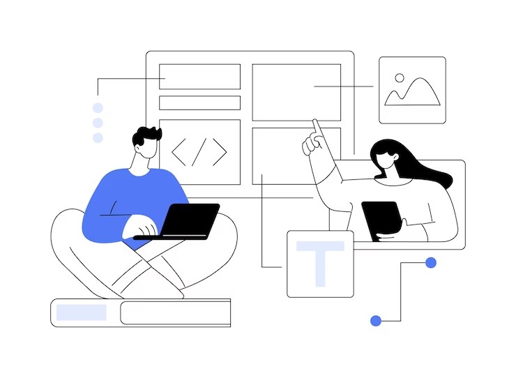
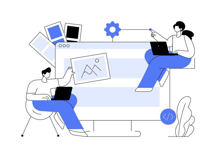
Our team of skilled designers and developers utilize responsive design techniques to create flexible and adaptable websites. This includes using fluid grids, flexible images, and CSS media queries to ensure that content and design elements automatically adjust to fit various screen sizes.
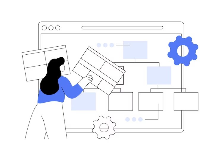
We thoroughly test the responsiveness of websites across multiple devices and screen resolutions to identify and address any potential issues. This ensures that your website looks and functions flawlessly on smartphones, tablets, laptops, and desktop computers.
In conclusion, mobile responsiveness is paramount in today’s mobile-centric world. With an increasing number of users accessing websites through mobile devices, it is essential to provide a seamless and optimized user experience across all devices. At NXT DIGI, we recognize the importance of mobile responsiveness and incorporate it into our design process to ensure your website is accessible, engaging, and visually appealing on any screen. Let us help you create a responsive website that captivates your audience and drives success in the mobile-driven digital landscape.